So I got a little too busy and my body finally gave into the pressure. I have been Sicky McSickerson for a few days but I am back among the living today.
I have a mission for you, my blog lurkers..you know...you stalkers that never leave a comment. Yeah, you know who you are.
I am finishing up some stuff on my new studio and I need your help. I'm getting ready to purchase my last BIG canvas for the big bare wall in my office and I need you to help me decide. I've narrowed it down to the pics below. They are all of my little muse, Quinn. Leave a comment and tell me which one you love and why. For real, please!!! Help. I cannot do it without you. THANK YOU!
Here they are, in no particular order...
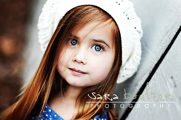
1.
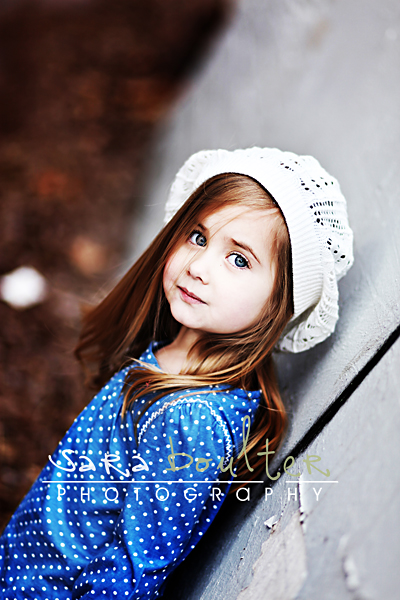
2.
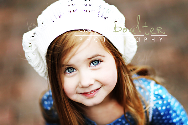
3.
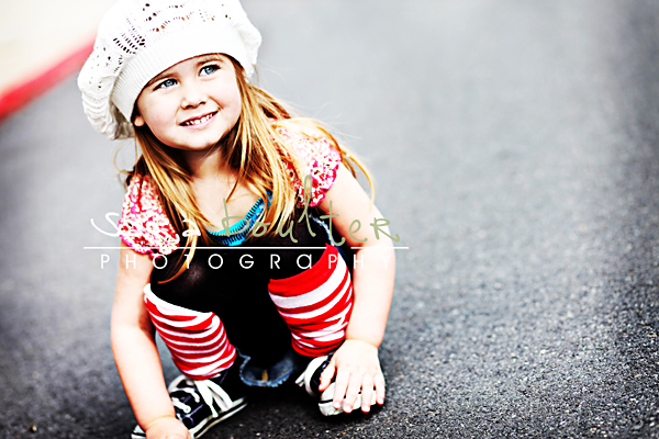
4.
5. Maybe BW? Ugh! I cannot decide! 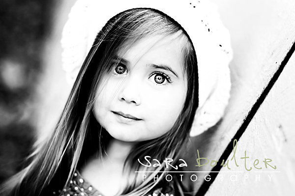
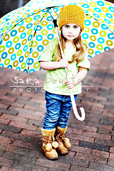
6.
A few outtakes from the shoot. My little Oliver loves Quinn. They are betrothed. This one kills me. He's drooling, she's walking around looking pretty. Ha!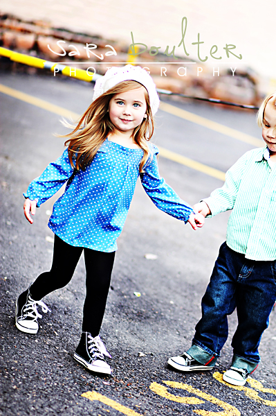
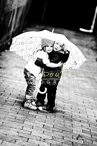
Monday, March 2, 2009
Crash, boom....
Posted by Sara Boulter at 4:44 PM
Subscribe to:
Post Comments (Atom)


43 comments:
5 AND 6 jumped out at me the most, love the sparkly eyes in 5 and the colors in 6 are so bright and happy!
nice to see you blogging again!
#1 for sure!
Sara...these are really cute!! I love the third pic :)
I would say 1 or 3. I love the simple pure look, but then I love the colorful, nawww, I see why you need help! I love the very last one also! good luck :)
Hands down, #1 (or the B/W version).
Hope that helped :)
I would have to say #1 or 5.
you already know....I love #6!!!
Sawa...this is Warra...
No 1 is great...the continuity of colours in the shot are all so harmonious. Then there is that cute lil Quinn. The muted stare is captivating.
But then there is No 6. The staredown and the sweetly haunting touch of fear in her lips and the slightly stiffened stance of her body draws ones mind way deep into the picture. The brown clay brick is an awesome canvass so she almost stands seperate from the background.
OK so 1 is great to look at but there is something more to 6. I';; ask Duncan and he can fart you an answer. ;)
bye Sawa!
The first one that stuck out to me is Number 1. THEN the umbrella ONE...AMAZING. Then the next one I loved is the colored one of her and your little guy. They are all amazing with awesome color. YEAH. Not so clear!!! LOVE them all what can I say. And yes, I do blog stalk you!
Ooh! Hard to pick! I'd have to go with #5 in the b&w or #6 with that fun colorful umbrella!!!
Kelly
My favorite is #1--that is the one I would choose. I also love #6 and the bright colors. Hard choice!!! How wonderful to have so many great ones to choose from.
I fit the bill as an absolute blog stalker, so I now feel obligated to pipe in on your pictures.
I would pick #6. #1 is also great with those beautiful eyes, but #6 is awesome!
And where do you find all these most beautiful kids in the world. Your work is art.
Kim
NUMERO UNO! Love it! It's perfect!
I can see why you are having a hard time choosing! These all are amazing... you can't go wrong. How big are you going and what are the colors of your office? LOVE #1.. her eyes are just so stunning and #6... the colors would look great on canvas. The last black and white is just too cute too. I know... do the first one in color as a HUGE canvas and the black and white one with your little dude smaller somewhere else in your studio. Whatever you do will be AMAZING! Good Luck and let us know what you decide.
Well I hate to be trendy but 1 and 6 but mostly 6 :)
Love you! Come see me!!!!!!!!!!!!!!!!!!!!!!!!!!!!!
NUmber 3- because she has that soft smile that will lighten up the day every time you look at it
Um. Too busy staring to be able to make an educated decision. HOLY COW, you're amazing.
I love 1, love it bw in 5 and LOVE 6! How will you ever choose???
#1 or #6... #1 because of her eyes and expression and number 6 because i love the colors... both are amazing!
I would go with #4! It's so fun and she is just the cutest!!
Wow!!! that is a hard decision they are all great!!!! I have to say #5, or #6 for sure but its a hard one!! I would choose #6 if you need a close up, or if you already have some close ups i would do #6 gosh I love them all!!!!
Hey Sara, I would say 1, 4, or 5. I also love the last picture with her and your son under the umbrella. Good luck deciding! :-)
I vote for 2 or 6. Can't wait to see them printed.
I would definitely say #1 it's simply beautiful.
#6 is amazing. Seriously, it took my breath away. Those colors! Those eyes! Stunning! I actually really love how the circles on the umbrella is kind of repeated by her beautiful eyes.
Jessica
www.MomShots.com
Hi, I'm Brandee. Great photography by the way. My pick is for sure #6 {because of the great colors} and then I really like #5 because of her sparkly eyes {and hands down am a b/w lover!} Good luck, can't wait to see what you have picked. Sorry for the blog stalking!
I like #3 or #6. I love simple close-ups like #3 and her eyes pop so great and I love her smile. #6 looks more artsy and is really cool and I love those colors, too! They are all so amazing!!! YOu do incredible work!
#1 is my absolute favorite!!! These are all adorable! But for a large canvas, i would chose 1! Good luck!
ooooh, tough call, 1, 5, or 6. I love a landscape for gallery wraps.
#5 and #6
I like #1 but that strand of hair sort of disrupts those eyes. So #5 appears more stunning.
#6 covers both whimsically colorful and serious, without looking like every other photo that people have of kids.
Sara, you know what...I think you are amazing and should print them all. Why not? Haha. I love the black and white #5 and I love the color and uniqueness of #6. It will look awesome no matter what you decide. You are to talented girl. Just so you know I LOVE the one with Oliver and the little girl under the umbrella in black and white. Its not a choice, but I still vote for it. -next door!
Lovin' #1!!!
1 and 6. I love love love the last one of the little love birds though. a studio? how exciting. congrats!!!
Of the choices? #5 hands down - I love the drama of the bw version and how you can't help but notice her eyes.
Of the non-choices? I also love the bw one of Quinn and Oliver under the umbrella. For all sorts of reasons.
Holy crow, this girl is gorgeous! I like #1 or #6. Wowsers...she is just beautiful. And those pics of her with little "O" are priceless. And yes...I'm a blog stalker. Hey BTW, what's the deal with you coming up?
YES...me too, blog stalker. I love, love #4 and #6. Bright and beautiful! You are getting a studio? How fun, I can't wait to see what you have in store for all of us! I would LOVE a studio....sigh....someday! Hey, what dates are you going to be in Vegas?? Let me know!
I'm Janelle. You don't know me. Found your blog on a friend's. Love your work...I am an aspiring photographer. I have to follow the crowd...I love #1 and #6. At first, I thought #1 for sure, but I'm leaning towards #6...more color and just seems to look more like something I would see on a huge canvas in a studio. #1 would be a great representation of your amazing work as well.
#1... Do it. That is the only advice you need. Mine. Also, if you can't decide, we can do a "private" shoot and you can just use one of me.
They are all great but I too love #1 and #6. The colors in #6 are AMAZING!!! I would choose it. They are all beautiful of course though.
I say #6...but #4 would be my 2nd choice.
Hi there...I do have to admit that I am a stalker of your work, your amazing :) I say # 6 if you dont have enough color cause it just POPS and # 5 if you need some interesting BW. I love them both. She is ADORABLE. I would love to see all the canvas's you chose when your done. GOOD LUCK!
~Brittney M. Lang
I say #1 hands down--the color is just too dramatic to do without! Is this the little chickie who played Sarah Palin? (still laugh about that one...).
Are you opening a new studio? How exciting! Hope you're feeling better.
The first one and the umbrella one. The first one is more timeless and the eyes are catching. Loving the hat.
But the umbrella is great with all the color really gets your attention.
Thanks for letting me lurk. I didn't think you would mind since it's not too peronal of a blog.
Don't comment for time sake but love your pictures.
Post a Comment